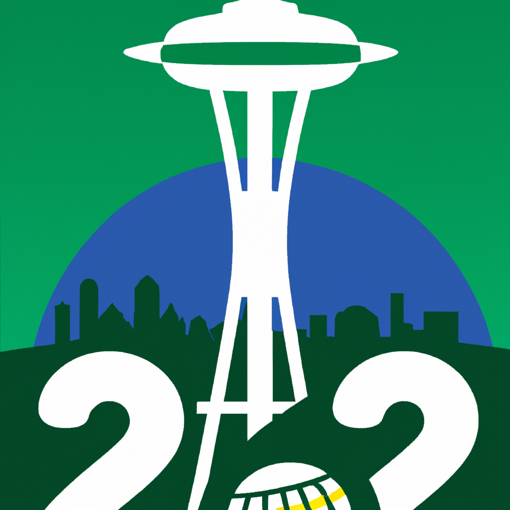
The city of Seattle is gearing up for the 2026 Men’s World Cup, and they recently revealed their official logo for the event. The logo was unveiled atop the iconic Space Needle, a 605-foot-tall tower that has become an iconic symbol of the city.
The logo is a vibrant blue and green design that features the Space Needle in the center. The colors are meant to represent the natural beauty of the Pacific Northwest, while also paying homage to the city’s maritime heritage. The logo also features a starburst pattern that is meant to represent the energy and excitement of the tournament.
The logo was designed by local Seattle-based artist, Ryan Henry Ward. Ward was inspired by the city’s unique landscape and culture, and wanted to create a design that would capture the spirit of Seattle. He also wanted to create a logo that would be recognizable around the world, and he believes he has achieved that goal.
The 2026 Men’s World Cup will be held in 16 different cities across North America, and Seattle is one of the lucky cities chosen to host some of the matches. This will be the first time that Seattle has hosted a major international soccer tournament, and it is sure to be an exciting event.
The unveiling of the logo atop the Space Needle was a fitting way to kick off the countdown to the tournament. The Space Needle has been a symbol of Seattle for over 50 years, and it is sure to be a popular spot for fans to gather during the tournament.
The 2026 Men’s World Cup is sure to be an exciting event, and Seattle is ready to show off its unique culture and landscape to the world. With their new logo, Seattle is sure to make a lasting impression on all who come to visit for the tournament.
